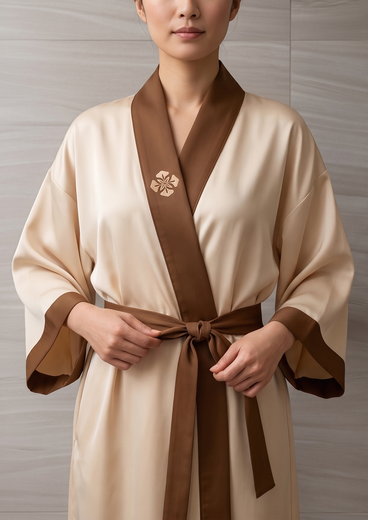
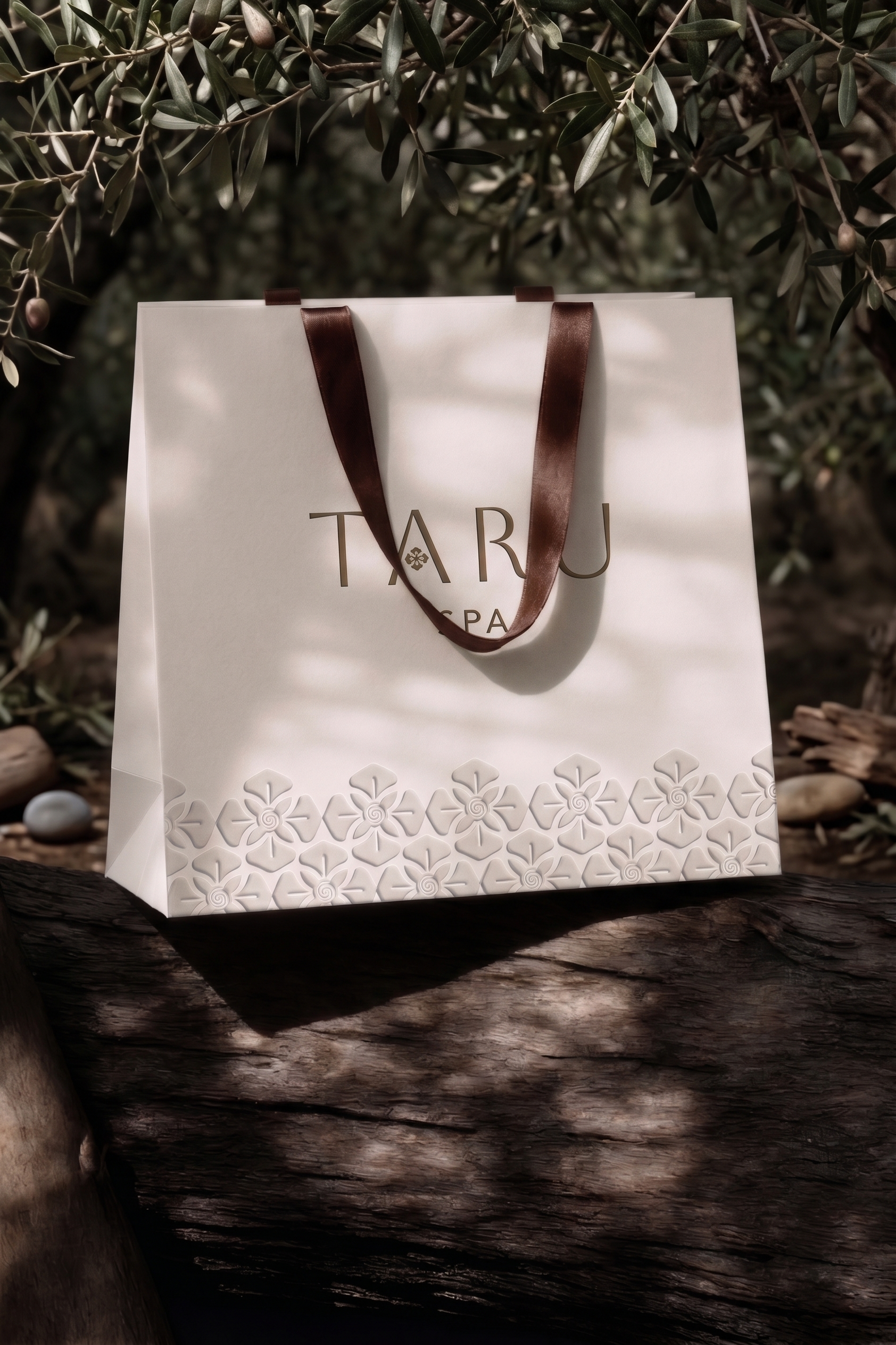
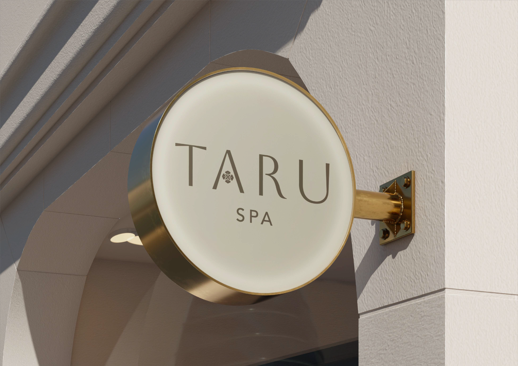
The logo of TARU Spa draws inspiration from Bunga Tarung, a sacred Dayak motif symbolizing courage, harmony, and the balance of life. Its petals are reinterpreted into soft, organic forms that echo the serenity of nature, leaves, blossoms, and flowing energy. At the center lies a subtle Dayak spiral, representing the inner healing journey and the continuous connection between body, mind, and spirit. The letter “R” is crafted with a gentle, blooming curve, symbolizing personal growth, renewal, and the unfolding of well-being, much like a flower that opens as it receives nourishment and care. This emblem reflects TARU Spa as a sanctuary where tradition meets tranquility. The floral geometry embodies protection and grounded strength, while the natural curves express calmness, relaxation, and the soft rhythm of holistic healing. Together, these elements create a visual identity that celebrates heritage, nature’s serenity, and the rejuvenating experience that defines every visit to TARU Spa.