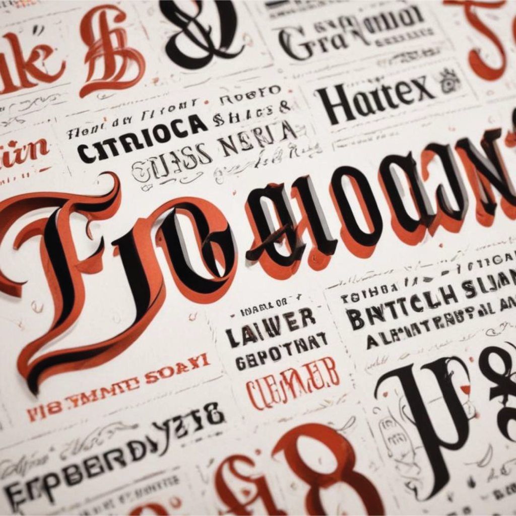
Typography is a powerful tool in brand design, often overlooked but critically significant. It shapes how audiences perceive and interact with a brand, conveying its personality, values, and voice. The right typography can create a memorable identity, evoke emotions, and ensure a cohesive visual experience.
Types of Fonts
Fonts are categorized into four main types: serif, sans-serif, script, and decorative.
Serif Fonts: These fonts have small lines or extensions at the end of each stroke. They are often seen as traditional, trustworthy, and formal. Common examples include Times New Roman and Georgia. Serif fonts are frequently used in print media, such as newspapers and books, to convey reliability and authority.
Sans-Serif Fonts: Lacking the extensions found in serif fonts, sans-serif fonts are clean, modern, and straightforward. They are popular in digital media due to their readability on screens. Notable examples are Arial and Helvetica. Sans-serif fonts are ideal for brands aiming for a contemporary and approachable image.
Script Fonts: Mimicking handwritten text, script fonts add a personal and elegant touch. They range from formal calligraphy to casual handwriting. Examples include Brush Script and Pacifico. These fonts are best used sparingly, often for logos or headings, to maintain readability.
Decorative Fonts: These fonts are highly stylized and unique, designed to capture attention. They are perfect for brands seeking a distinctive and creative look. Examples include Comic Sans and Impact. However, due to their intricate designs, they should be used selectively to avoid overwhelming the audience.
Choosing The Right Typeface
Selecting the appropriate typeface is crucial in aligning with a brand’s identity. Here are some tips:
Understand the Brand’s Personality: A brand’s typeface should reflect its core values and personality. For instance, a tech company might opt for a sleek sans-serif font, while a luxury brand could choose a sophisticated serif or elegant script.
Consider Readability: The chosen typeface must be easy to read across different mediums, from websites to printed materials. Avoid overly decorative fonts for body text as they can hinder readability.
Test for Versatility: Ensure the typeface works well in various sizes and formats. A versatile typeface maintains its clarity and style whether it’s on a business card or a billboard.
Consistency in Usage
Maintaining consistency in typography across all brand materials is vital for a cohesive brand identity. Inconsistencies can confuse the audience and weaken brand recognition. Here’s how to ensure consistency:
Develop Brand Guidelines: Create a comprehensive style guide that outlines the specific fonts to be used, along with their sizes, colors, and spacing. This guide should be accessible to everyone involved in creating brand materials.
Stick to a Limited Font Palette: Limiting the number of fonts used helps maintain a clean and professional look. Typically, two to three fonts (for headings, body text, and accents) are sufficient.
Regular Audits: Periodically review all brand materials to ensure adherence to the typography guidelines. This helps in identifying and correcting any deviations.